Harness
Challenge
Harness needed to communicate that they have a badass product and build a website reflective of an iconic brand. Messaging and content needs re-wiring of hierarchy, architecture. The tone needed to be technical and easy to understand but lead with a tone of empowerment visuals. Collaboratively working with the client and our internal team to create a strong foundation for a website.
Solution
Collaboratively working with the client and our internal team to create a strong foundation for a website. Harness came to us to think through the whole experience of their website. I supported another designer with the development site maps and wireframes while thinking of the user experience of their site.
Role
Design
UI UX Design
Concepting
Visual Design
Illustration
Project Type
Website
2019
Emotive Brand
Project Year
2019
Project Year
2019

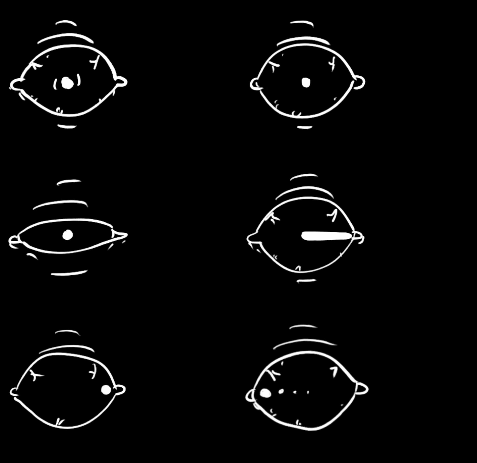
After helping out with the structure and bones of the site, we decided to build out 3 directions to share with the client. I was in charge of the "Refresh" direction and had some help from a freelance illustrator. As the directions were almost done and ready to share with the client, I helped out with other bits and parts of other directions to get it across the finish line.

Locations
Harness wanted illustration to represent different locations of the company. I developed these following five illustrations for San Francisco, Bangalore, Dallas, London, and Mountain View.


